The Psychology Behind Workplace Safety Signs: Why Visual Communication Matters
Safety signs serve as visual cues that alert workers to potential hazards and provide essential instructions to prevent accidents and injuries. Explore the significance of workplace safety signs, right from the psychological aspects of their design and impact on employees.
In every industry, workplace safety is of the utmost importance. Especially in critical sectors where employees contend with diverse hazards, dangerous chemicals, extreme temperatures, and beyond. To safeguard the well-being of workers amongst these challenges, employers must adopt rigorous safety protocols and procedures.
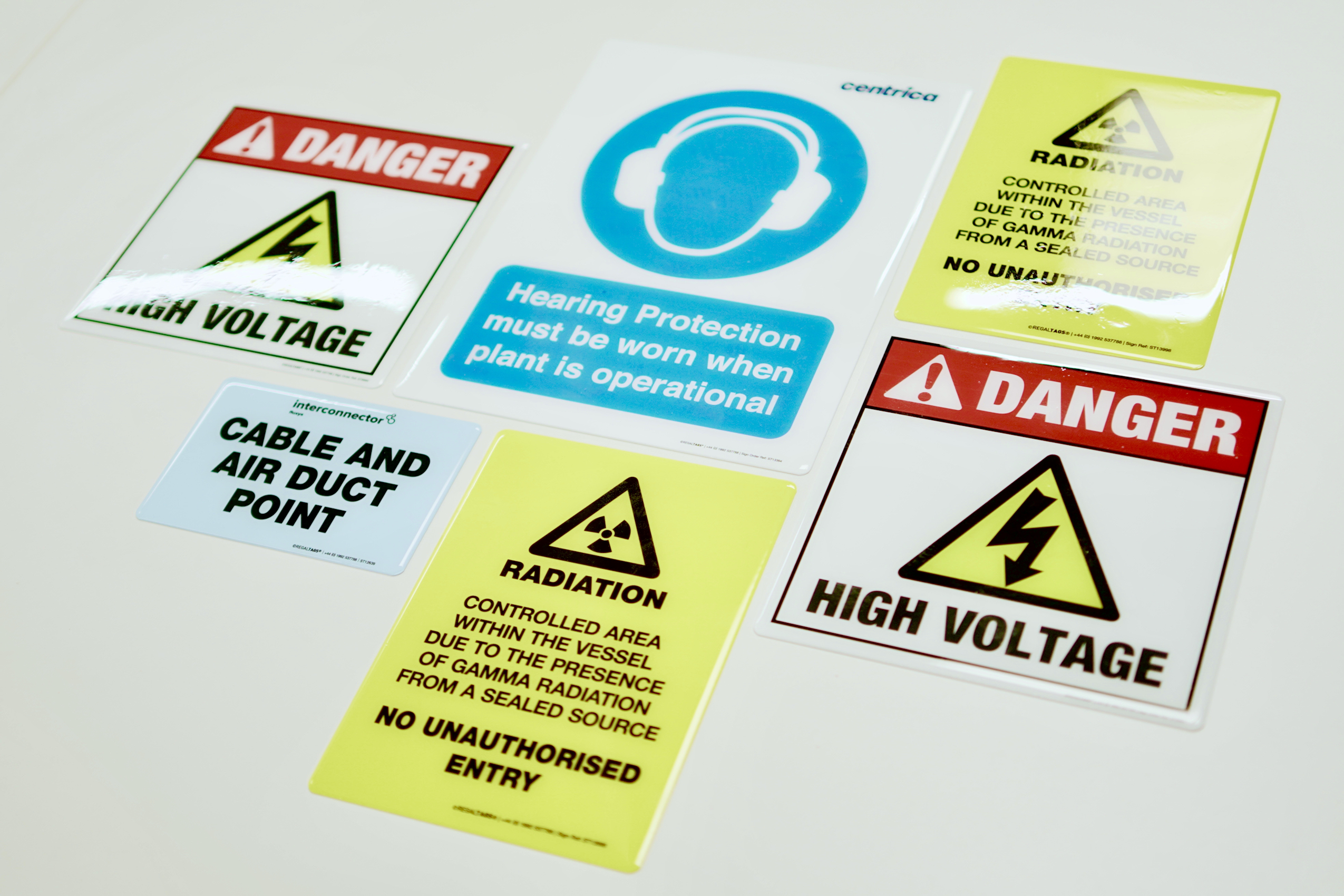
A fundamental aspect of maintaining a safe work environment is the deployment of safety signs. These visual markers play a pivotal role in signalling potential hazards to workers while furnishing vital instructions on avoiding mishaps and injuries. In this blog post, we delve into the importance of workplace safety signs and explore the psychology behind their design and impact on employees.
The power of visual communication
Humans are highly visual beings. We process visual information faster than text and are more likely to retain and act upon what we see.
In fact, research shows that the human brain processes images 60,000 times faster than text, and 90% of all information transmitted to the brain is visual.
Workplace safety signs leverage this inherent human trait to communicate vital messages quickly and effectively. Here's why visual communication matters in the context of workplace safety signs:
- Immediate understanding: Visual communication is a universal language. Regardless of a person's native language or literacy level, images and symbols can convey meaning almost instantly. For example, a red circle with a slash through it over an image of an open flame communicates "No Open Flames" clearly, even to someone who may not understand the words themselves. This immediate understanding is crucial in emergency situations where every second counts.
- Rapid processing: The human brain is wired to process visual information at lightning speed. This rapid processing is particularly important in the context of safety signs because it allows individuals to react swiftly to potential hazards. For example, when a person sees a "Slippery When Wet" sign with a graphic of a person slipping, their brain quickly registers the message, prompting them to exercise caution.
- Retention and recall: Visual information is more likely to be retained and recalled compared to text-based information. This phenomenon is often referred to as the "picture superiority effect." Simply put, people tend to remember images and symbols better than words. When employees encounter safety signs with strong visual elements regularly, they are more likely to remember safety protocols and guidelines, leading to safer behaviour in the long run.
- Reduced cognitive load: Safety signs reduce the cognitive load on individuals. In complex work environments, employees may be bombarded with various tasks and information. Safety signs simplify the communication of safety instructions by presenting them in a format that requires minimal cognitive effort to understand. For instance, instead of reading a paragraph about the location of fire extinguishers, a simple pictogram of a fire extinguisher with an arrow pointing the way conveys the same information, but in a more efficient and easier-to-digest way.
- Universal applicability: Visual communication through safety signs also transcends cultural and language barriers. In workplaces with diverse populations, safety signs with clear, universally understood symbols and colours ensure that everyone receives the same safety message. This inclusivity is vital for maintaining consistent safety standards across the organisation.

The psychology behind effective safety signs
To create safety signs that truly resonate with individuals, it's essential to consider the psychological principles that underlie their design:
- Colour psychology: Colours evoke emotions and reactions. For example, red signals danger and immediate attention, while green conveys safety and permission. Safety signs use these colour cues to convey urgency or safety.
- Iconography: The use of icons or symbols is crucial. Icons are often more universally understood than words. For instance, a fire symbolises the presence of fire or a fire extinguisher, even without text.
- Contrast and visibility: The contrast between the sign's background and the symbols or text is vital. High contrast ensures visibility even in low-light conditions, ensuring that the sign grabs attention.
- Consistency: Consistency in design and placement of safety signs throughout the workplace is essential. Familiarity with sign placement ensures that employees can quickly locate and interpret signs in emergency situations.

Workplace safety signs from the experts, REGALTAG
At REGALTAG, we provide tough workplace safety signage that meets all safety specifications and needs.
We believe every signage application is unique and that’s why all our signs are completely customisable so you can ensure they’ll be most effective for you. Our designers can guide you through with up-to-date knowledge of industry best practices and 1000’s of tried and tested existing signs for inspiration.
If you’d like to find out more about how we can help with your safety signs, contact our friendly team at REGALTAG® today. We’re more than happy to answer any questions you have and can guide you through each material option.
Subscribe
Join 10,000+ others receiving our monthly updates. Free Tag knowledge delivered straight to your inbox.


